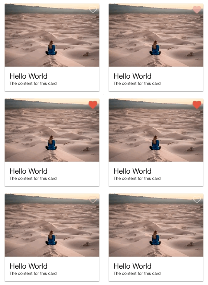
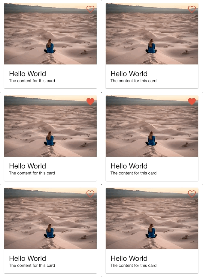
In this tutorial, we are going to work on building an animated “like” button that will look like this when clicked:

Since Ionic provides both a “full” and “empty” heart icon:

It is easy enough to create an “on/off” or “liked/unliked” state for a like button that uses these icons – you would just use a different icon depending on whether or not the button had been clicked – but, the result is a little more boring than if we put a little more effort into animating it:

Although functionally both of these examples are the same, the first example is a lot “juicier” and is more satisfying to click. The example we will be building won’t provide as much as eye-candy as Twitter’s own like animation does (which even includes a little sparkly/confetti animation):

But, we will strike a nice middle ground with something that looks pretty good and is still reasonably easy to implement. We will be building this like button as our own custom component that makes use of the Angular Animations API.
Before We Get Started
Last updated for Ionic 4.0.0-beta.7
Before you go through this tutorial, you should have at least a basic understanding of Ionic concepts. You must also already have Ionic set up on your machine, and an Ionic project created.
This article will also be making use of the Angular Animations API, but we will not be covering that in-depth in this article (we will just cover the basic set up steps). If you would like to learn more about how the Angular Animations API works, I would recommend reading Using the Web Animations API in Ionic.
If you’re not familiar with Ionic already, I’d recommend reading my Ionic Beginners Guide or watching my beginners series first to get up and running and understand the basic concepts. If you want a much more detailed guide for learning Ionic, then take a look at Building Mobile Apps with Ionic.
1. Set up the Angular Animations API
Before we can start building our like button, there are a couple of things we need to do to set up Angular animations. First, we will need to install the @angular/animations package.
Run the following command:
npm install @angular/animations --saveWe will also need to import the BrowserAnimationsModule in the root module for our application.
Include the following import in src/app/app.module.ts:
import { BrowserAnimationsModule } from '@angular/platform-browser/animations';Add the
BrowserAnimationsModuleto theimportsarray in the root@NgModulein src/app/app.module.ts:
imports: [BrowserModule, BrowserAnimationsModule, IonicModule.forRoot(), AppRoutingModule],With that done, we should now be able to make use of the Angular Animations API in our components.
2. Build the Custom Component
So that we can easily reuse this like button that we will be creating, we will be building it into a custom component called AnimatedLike. This will allow us to drop this component wherever we like in our templates just by using:
<app-animated-like></app-animated-like>Run the following command to create a custom component
ionic g component components/AnimatedLikeOnce the component has been generated, we can start working on it. We are going to start by creating the template for the component.
Modify src/app/components/animated-like/animated-like.component.html to reflect the following:
<ion-icon
  (click)="toggleLikeState()"
  tappable
  [@heart]="likeState"
  size="large"
  [name]="iconName"
></ion-icon>
The template is reasonably simple, it’s just an <ion-icon> component with a few extra things attached. Rather than just supplying the name of the icon, e.g:
<ion-icon name="heart"></ion-icon>We are instead binding the name property to the iconName class member (which we will create later):
<ion-icon [name]="iconName">This is so that we can easily switch between two different icons – heart and heart-empty – depending on whether the user has clicked this component or not. We also have the Angular animation trigger attached to the icon – we have attached the heart trigger to the likeState class member which we will also define later. We will be able to change this likeState in order to control the state of the animation that we have defined for the @heart trigger. Finally, we have a (click) event bound to toggleLikeState() which will handle toggling the animation state and the icon that is used.
Now let’s take a look at the logic for this component.
Modify src/app/components/animated-like/animated-like.component.ts to reflect the following:
import { Component, OnInit } from '@angular/core';
import { trigger, state, style, animate, transition } from '@angular/animations';

@Component({
  selector: 'app-animated-like',
  templateUrl: './animated-like.component.html',
  styleUrls: ['./animated-like.component.scss'],
  animations: [
    trigger('heart', [
        state('unliked', style({
            color: '#fff',
            opacity: '0.5',
            transform: 'scale(1)'
        })),
        state('liked', style({
            color: '#e74c3c',
            opacity: '1',
            transform: 'scale(1.1)'
        })),
        transition('unliked <=> liked', animate('100ms ease-out'))
    ])
  ]
})
export class AnimatedLikeComponent implements OnInit {

  public likeState: string = 'unliked';
  public iconName: string = 'heart-empty';

  constructor() { }

  ngOnInit() {

  }

  toggleLikeState(){

    if(this.likeState == 'unliked'){
      this.likeState = 'liked';
      this.iconName = 'heart';
    } else {
      this.likeState = 'unliked';
      this.iconName = 'heart-empty';
    }

  }

}
In our @Component decorator, we have set up our heart trigger as well as its animation states. Again, if you are not already familiar with the Angular Animations API, I would recommend that you read Using the Web Animations API in Ionic.
We have an unliked state that will set the color of the icon to white, it will have an opacity of 0.5, and it will be its regular size. The liked state will change the color to red, it will receive full opacity, and the icon will be scaled up slightly to 1.1x its original size. We have defined a two-way transition from the liked state to the unliked state (and vice versa) that will animate these changes over 100ms with an ease-out animation easing.
The toggleLikeState() function handles switching both the iconName and the likeState. The animation that we have created will trigger whenever the likeState changes from liked to unliked or from unliked to liked.
That’s all there is to this component, now we just have to make use of it.
3. Use the Component
In order to use the component, we will need to add it to the module file for the page that we are using it on. As an example, we will walk through adding it to the home page of a blank Ionic application.
Modify src/app/home/home.module.ts to reflect the following:
import { NgModule } from '@angular/core';
import { CommonModule } from '@angular/common';
import { IonicModule } from '@ionic/angular';
import { FormsModule } from '@angular/forms';
import { RouterModule } from '@angular/router';

import { HomePage } from './home.page';
import { AnimatedLikeComponent } from '../components/animated-like/animated-like.component';

@NgModule({
  imports: [
    CommonModule,
    FormsModule,
    IonicModule,
    RouterModule.forChild([
      {
        path: '',
        component: HomePage,
      },
    ]),
  ],
  declarations: [HomePage, AnimatedLikeComponent],
})
export class HomePageModule {}
and then we would be able to add it to the template for the home page.
Modify src/app/home/home.page.html to reflect the following:
<ion-header>
  <ion-toolbar color="danger">
    <ion-title> Heart Animation </ion-title>
  </ion-toolbar>
</ion-header>

<ion-content padding>
  <ion-card>
    <app-animated-like></app-animated-like>

    <ion-img
      src="https://images.unsplash.com/photo-1536007164800-b7f11331f35c"
    ></ion-img>

    <ion-card-content>
      <ion-card-title>Hello World</ion-card-title>

      <p>The content for this card</p>
    </ion-card-content>
  </ion-card>
</ion-content>
In this example, we are adding the like button to the header image for a card. You could use the component wherever or however you like, but in this instance, we would need to add a little bit of extra styling so that it displays correctly on top of the image:
Modify src/app/home/home.page.scss to reflect the following:
ion-card app-animated-like {

position: absolute;

top: 5px;

right: 5px;

}
If you were to follow this particular example, you would now have something that looks like this:

Summary
It’s a little bit of extra work to achieve a relatively simple looking effect, but little details like this can really increase the overall quality of the application (assuming that the animations are done well – they can have the opposite effect sometimes). The good news is that we now have a reusable component that we can easily add anywhere in the application, and we could even easily add it to any future application as well.

