I’ve written a few articles in the past that covered using the Angular Animations API in an Ionic application. You can find some of those articles below:
- The Web Animations API in Ionic
- Add to Cart Animation
- Animating from the Void: Enter and Exit Animations in Ionic
Most of the tutorials that I have created so far focus on reasonably simple animations, but the Angular Animations API is powerful and can handle much more complicated animations.
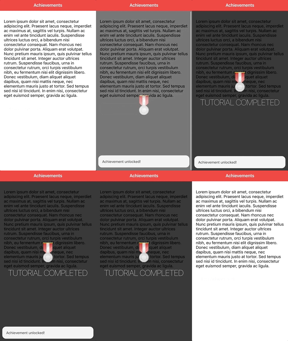
In this tutorial, we will be focusing on implementing an animation sequence to create an “achievement unlocked” overlay in an Ionic application. The end result will look like this:

Unlike previous tutorials, this animation will involve animating child elements of the parent animation. This has some implications for the code we write.
We are going to focus specifically on the animation in this tutorial. We will just be adding everything to the Home page of the application rather than creating any custom components/services.
I think it would be interesting to develop a more fully fleshed out achievements/gamification system that could be dropped into an application, though. If this is something you would like to see me take further, let me know in the comments.
Before We Get Started
Last updated for Ionic 4, beta.15
This is an advanced tutorial that assumes you already have a decent working knowledge of the Ionic framework. If you require more introductory level content on Ionic I would recommend checking out my book or the Ionic tutorials on my website.
This tutorial will also require some level of familiarity with the Angular Animations API.
Set Up the Angular Animations API
Before we jump into the code, we will need to install the Angular Animations API in our Ionic application. To do that, you will just need to install the following package:
npm install @angular/animations --saveand you will also need to add the BrowserAnimationsModule to your app.module.ts file:
import { NgModule } from '@angular/core';
import { BrowserModule } from '@angular/platform-browser';
import { RouteReuseStrategy } from '@angular/router';

import { IonicModule, IonicRouteStrategy } from '@ionic/angular';
import { SplashScreen } from '@ionic-native/splash-screen/ngx';
import { StatusBar } from '@ionic-native/status-bar/ngx';

import { AppComponent } from './app.component';
import { AppRoutingModule } from './app-routing.module';

import { BrowserAnimationsModule } from '@angular/platform-browser/animations';

@NgModule({
  declarations: [AppComponent],
  entryComponents: [],
  imports: [
    BrowserModule,
    BrowserAnimationsModule,
    IonicModule.forRoot(),
    AppRoutingModule,
  ],
  providers: [
    StatusBar,
    SplashScreen,
    { provide: RouteReuseStrategy, useClass: IonicRouteStrategy },
  ],
  bootstrap: [AppComponent],
})
export class AppModule {}
The Template
Before we work on the animation, we are going to set up the basic template both for our home page and the overlay that we will be animating.
Modify src/app/home/home.page.html to reflect the following:
<ion-header>
  <ion-toolbar color="danger">
    <ion-title> Achievements </ion-title>
  </ion-toolbar>
</ion-header>

<ion-content padding>
  <div *ngIf="displayAchievement" class="achievement-container">
    <div class="medal">
      <img src="assets/medal.png" />
    </div>

    <div class="message">
      <h5>Tutorial Completed</h5>
    </div>
  </div>

  <p>
    Lorem ipsum dolor sit amet, consectetur adipiscing elit. Praesent lacus
    neque, imperdiet ac maximus at, sagittis vel turpis. Nullam ac enim vel ante
    tincidunt iaculis. Suspendisse ultrices luctus orci, a bibendum nisi
    consectetur consequat. Nam rhoncus nec dolor pulvinar porta. Aliquam erat
    volutpat. Nunc pretium mauris ipsum, quis pulvinar tellus tincidunt sit
    amet. Integer auctor ultrices rutrum. Suspendisse faucibus, urna in
    consectetur rutrum, orci turpis vestibulum nibh, eu fermentum nisi elit
    dignissim libero. Donec vestibulum, diam aliquet aliquet dapibus, quam nisi
    mattis neque, nec elementum mauris justo at tortor. Sed tempus sed nisi id
    tincidunt. In enim nisi, consectetur eget euismod semper, gravida ac ligula.
  </p>

  <ion-button (click)="test()" color="light" fill="outline"
    >Test Achievement</ion-button
  >
</ion-content>
Aside from the basic layout, we have added a <div> that contains our achievement overlay and its child elements. Eventually, we will be animating this. I am using a badge from Kenney’s assets as the achievement icon, but you can use whatever you like. We have also added a button to trigger the animation.
We will need to define the corresponding event binding for that button, along with the displayAchievement class member:
Modify src/app/home/home.page.ts to reflect the following:
import { Component } from '@angular/core';
import { ToastController } from '@ionic/angular';
import { trigger, style, animate, transition, group, query, animateChild } from '@angular/animations';

@Component({
  selector: 'app-home',
  templateUrl: 'home.page.html',
  styleUrls: ['home.page.scss'],
})
export class HomePage {

  public displayAchievement: boolean = false;

  constructor(private toastCtrl: ToastController){

  }

  test(){

    this.toastCtrl.create({
      message: 'Achievement unlocked!',
      duration: 2000
    }).then((toast) => {
      toast.present();
    });

    this.displayAchievement = true;

    setTimeout(() => {
      this.displayAchievement = false;
    }, 3000);

  }

}
Our test method handles toggling the displayAchievement class member on an off. We also trigger a toast to display the “Achievement unlocked!” message at the bottom of the screen.
We will also need to add a few styles to our overlay:
Modify src/app/home/home.page.scss to reflect the following:
.achievement-container {
  z-index: 100;
  width: 100%;
  height: 100%;
  background-color: rgba(0, 0, 0, 0.8);
  display: flex;
  align-items: center;
  justify-content: center;
  flex-direction: column;
  position: absolute;
  top: 0;
  left: 0;
}

h5 {
  color: #fff;
  text-transform: uppercase;
  font-weight: lighter;
  font-size: 2em;
  text-shadow: -1px 2px 15px rgba(0, 0, 0, 0.7);
}
Container Animation
With the basic layout set up, let’s focus on creating the animations. We will start by just animating the container itself. This is going to be a simple opacity animation that transitions from 0 opacity to 1 opacity.
Add the following animation to src/app/home/home.page.ts:
@Component({
  selector: 'app-home',
  templateUrl: 'home.page.html',
  styleUrls: ['home.page.scss'],
  animations: [

    trigger('container', [
      transition(':enter', [
          style({opacity: '0'}),
          group([
            animate('500ms ease-out', style({opacity: '1'}))
          ])

      ]),
      transition(':leave', [
          group([
            animate('500ms ease-out', style({opacity: '0'}))
          ])
      ])
    ])

  ]
})
We are defing transitions on both :enter and :leave (which is the equivalent of void => * and * => void respectively, it is just easier to write).
For the :enter animation we start with an opacity of 0 and then we animate to an opacity of 1 over 500ms with an ease-out easing. The :leave animation is mostly the same, just in reverse.
Notice that we are using an animation group here. This isn’t required for a single animation, but eventually we will be triggering the animations for our child elements within those groups.
We will need to add the container trigger to the container in our template.
Add the
@containertrigger to the container in home.page.html:
<div *ngIf="displayAchievement" class="achievement-container" @container></div>If you were to run the animation now, you would see the achievement overlay fade in and then fade back out again. It doesn’t actually look too bad with just this, but we are going to take it a step further by animating the badge and text elements as well.
Child Element Animations
We are animating the element that contains both of the other elements we also want to animate. There is a bit of a trick to triggering these animations as they won’t run by default.
We are going to add triggers for both the badge and the message, but we will also need to add them to the animation group and trigger their animations manually.
Modify the animations in home.page.ts to reflect the following:
@Component({
  selector: 'app-home',
  templateUrl: 'home.page.html',
  styleUrls: ['home.page.scss'],
  animations: [

    trigger('container', [
      transition(':enter', [
          style({opacity: '0'}),
          group([
            animate('500ms ease-out', style({opacity: '1'})),
            query('@badge, @message', [
              animateChild()
            ])
          ])

      ]),
      transition(':leave', [
          group([
            animate('500ms ease-out', style({opacity: '0'})),
            query('@badge, @message', [
              animateChild()
            ])
          ])
      ])
    ]),

    trigger('badge', [
        transition(':enter', [
            style({transform: 'translateY(400%)'}),
            animate('500ms ease-out', style({transform: 'translateY(0)'}))
        ]),
        transition(':leave', [
            animate('500ms ease-in', style({transform: 'translateY(400%)'}))
        ])
    ]),

    trigger('message', [
      transition(':enter', [
          style({opacity: '0'}),
          animate('500ms 1000ms ease-out', style({opacity: '1'}))
      ]),
      transition(':leave', [
          animate('500ms ease-in', style({opacity: '0'}))
      ])
    ])

  ]
})
Let’s discuss the animations themselves first. We have added triggers for badge and message - both with corresponding enter and leave animations.
The badge animation will cause the badge to fly in from the bottom, as we are animating translateY. When the enter animation is triggered the badge will start off screen and fly to its normal position. On leaving, the badge will begin to move off screen again.
The message animation is just another simple opacity animation. However, we add a delay on this animation so that it triggers after the other elements have already animated in. I think this adds a little more intrigue to the animation.
We will need to add these triggers to our template, but that in itself isn’t enough. We have also added these animations to the animation group:
    trigger('container', [
      transition(':enter', [
          style({opacity: '0'}),
          group([
            animate('500ms ease-out', style({opacity: '1'})),
            query('@badge, @message', [
              animateChild()
            ])
          ])

      ]),
      transition(':leave', [
          group([
            animate('500ms ease-out', style({opacity: '0'})),
            query('@badge, @message', [
              animateChild()
            ])
          ])
      ])
    ]),
We query those elements by their trigger names, and then we manually run the animation by calling animateChild, which will trigger the animations we have already defined.
Now we just need to add those triggers to the template.
Modify the badge and message elements in home.page.html to reflect the following:
<div class="medal" @badge>
  <img src="assets/medal.png" />
</div>

<div class="message" @message>
  <h5>Tutorial Completed</h5>
</div>
If you run the animation now, you should have something that looks like this:

Summary
Although the focus for this tutorial has just been on the animations, there is room to improve this functionality to be useful in a more general sense. Right now, it is hard coded and tied to the home page, but there is the potential to develop this into something that could be triggered dynamically.
If this would be of interest to you, rather than just the animations themselves, let me know in the comments.

